All typography should pass WCAG 2.0 AA standards for the color contrast test. You can test color contrast at https://contrastchecker.com
Montserrat 700, Title Casing, #ff6100, 40px / 42px
Montserrat 600, Title Casing, #ff6100, 32px / 34px
Montserrat 700, Title Casing, #ff6100, 17.5px / 21px
Paragraph Text
Montserrat 500, #606060, 15px / 20px
This is an unordered list:
Montserrat 500, #606060, 15px / 20px
This is an ordered list:
Montserrat 500, #606060, 15px / 20px
This is the primary Instinct® logo lockup. The logo should be used in its entirety, as is, in all cases possible. Please use the logo as provided and don’t remove, adjust or seperate the shape, lettering, registration marks, lines or color.
The Instinct logo and the Instinct orange color is a primary means of visual identification for our brand. The consistent use of our logo with the approved Instinct orange will build strong external recognition and memorability for Instinct.
The Instinct orange logo is approved to be used on light or dark backgrounds or on photos.
Logo on dark backgrounds
Logo on light backgrounds
Logo on images
Do not change the color of the logo
Do not remove any elements of the logo
Do not use “Instinct® The Raw Brand®” by itself on any unapproved background colors or images
Do not squeeze, stretch, or change the size ratio of the logo
Do not try to recreate or modify the logo in any way
Do not use “Instinct® The Raw Brand®” by itself even if the lettering is orange
Below are all of the colors that appear on the site organized by which background color they appear over and what page elements they are used for in order to ensure maximum legibility and consistency.
#ffffff
#fbdfca
#ebf0f4
#f5f5f5
#283745
#283745
Main site icons are used in tandem with a concept, page, link, form, or tool to help the user easily grasp the functionality or intention. When creating new icon files, the icon should be in the center of the canvas and saved as an .svg file. The icons should appear on the site with a height of 55px and a variable width depending on the proportion of the specific icon. The icons should appear with either a light orange or white background blob depending on the background color of the page area they are appearing on. Strokes can very in width depending on the complexity of the linework in each icon.
High Pressure Processing icons are used with descriptions of the HPP process in order to demonstrate to users what goes into the process and what the benefits of it are. These icons should be 55px tall and 55px wide.
Pet Silhouette Icons are used across the site and in tools such as the Product Recommender to indicate whether a section is relevant to a dog, cat, or both, as well as which lifestage that section is most relevant to. Pet silhouettes appear at varying sizes throughout the site and can appear with our without a light orange background blob. When appearing as button icons in tools such as the Product Recommender, Pet Silhouettes should appear as gray and transition into dark blue (#283745) on mouse over.
Animal Silhouette Icons are used across the site to indicate and link to products containing different kinds of ingredients. The hexagonal versions are used on product line pages to link out to what options are available for each form of food and lifestage of pet. The silhouettes on their own are used in tools such as the Product Recommender as button icons allowing the user to select different ingredient preferences. When used as button’s, the silhouettes should appear gray then change to dark blue (#293645) on mouseover. Animal Silhouette Icons appear at varying sizes throughout the site.
The Social Media Icons link to our social media sites. Social media sites have the logo artwork available for download. Please download the current and accurate logos from their respective sites. Can be colorized using brand colors.
Utility Icons are used across the site to communicate a specific function and/or indicate a status. The color scheme of a Utility Icon and its active state can depend on the color scheme of the area of the site in which it is being used, and should always follow brand guidelines.
All images should either be stock or owned imagery. Images should be chosen and cropped with different aspect ratios and sizes in mind in order to prevent vital pieces of the images from being cut off on different devices.
Hero images need enough space on the left for a headline. When cropping a hero image for mobile, if there isn’t a way to legibly overlay the image with a headline, the headline can be center-aligned and moved down below the hero image. Desktop hero images should be 1500px wide with variable height, and mobile hero images should be 600px wide with variable height.
Hero images for dog and cat product line pages should feature images of pets eating Instinct Pet Food, or product shots of Instinct Pet Food.
Headlines overlaying a page’s hero image should appear either in white, orange (#ff6100), or blue (#283745) depending on which color will give it the most contrast and legibility against the background image.
To view/download images used on instinctpetfood.com, visit our site image library.
Image LibraryThe Instinct Raw Pet Food website tone is informative and fun. It isn’t afraid to make plays on the word “raw” (Reap the Raw Benefits, A Range of Raw Options) or to quip about pets in unusual ways (Pet’s Best Friend Speaks). After all, pet owners are a loving and fun-loving bunch. When speaking about research, the Instinct tone is more direct and professional, and does not have asides or pet puns (especially when getting into the nitty gritty). When talking about product, testimonials, or the benefits of raw, we can be more playful, using phrases like “furry friend,” “taste they’ll sit and stay for,” and more.
Words to avoid: Fluffy, angel baby (any funny term of endearment for pet), Instinct in a play on words (i.e. “follow your Instincts)
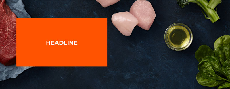
Words to include: best friend, raw, tail-wagging
The site is designed on the Bootstrap 5.0.2 Grid. Visit the Bootstrap site to learn about layout and grid details and guidelines.